In 2019, I designed the telephony interface for Caller, the native calling solution in Pipedrive. This turned out to be one of the most fun and challenging bits of UI work I had ever done.
Early wireframes
The project started off for me as a "make a couple of quick mockups for the executive board" type of task, without any certainty that it would be an actual project. I'm going to show you some of the rough stuff here, as it's probably cool to see where I started from and what did I end up with.
Concept 1
Concept 1 – Calling interface right to the phone number as a popover
I realized that the popover wouldn't be usable, as the component in essence is temporary and contextual, but the user would most probably like to scroll around on the page and perhaps navigate away to find more info, and this would not allow it.
Concept 2
Concept 2 – A telephony widget on the top navigation bar

Concept 2.2 – An exploration of a more information dense and less view-dependent widget
The telephony widget at the top had potential but it covered up the view in an unreasonable way and cluttered the already tight top bar.
Concept 3
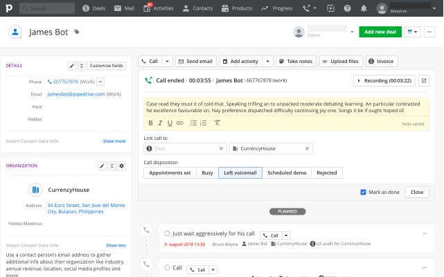
The third version had an entry point and logging interface in the CRM entity detail view. That was accompanied by a telephony widget on the top navigation for actions with the call if the user were to navigate away from the page. The aim was to utilize the "activity area" on top of the detail views that we had in place anyway and that the users were used to. The cluttered top bar issue wasn't solved and a majority of the interaction was still tied to one concrete view.

Concept 4
This concept had a full-width telephony that the bottom of the top navigation bar with the intention of it being page-independent and less obtrusive. That solution as a whole was an ugly mess:
* the interface is spread across the whole viewport width, requiring unnecessarily big mouse and eye movement from the user;
* the telephony would push the whole content down;
* the call controls, note-taking, settings, and recording were all in separate parts of the interface, some tied to the telephony, some to the detail view.

Concept 5 and First Prototype
With the fifth concept, I took another route in the form of a floating Calling Bar. Of course I didn't come up with it completely on my own, I remember at least one brainstorming session on it with my colleague Taimar. Zoom's floating Meeting Controls might have had an influence too :).
Out of all the concepts, this felt like the most feasible and mature one, and although a lot of work on the details would still follow, we did stick to the basic principle of a floating Calling Bar.
Further research
After the project had been improved in principle, a proper design process was followed.
We did look at the number of calls being made via third-party integrations and our mobile app to understand the possible market reach. We looked at call activities logged in Pipedrive in general and how the numbers differed by market and company size. We sent out a survey to understand our customer habits and needs for calling and the perspective of the native solution's adoption, and later of course multiple rounds of internal and external user testing.
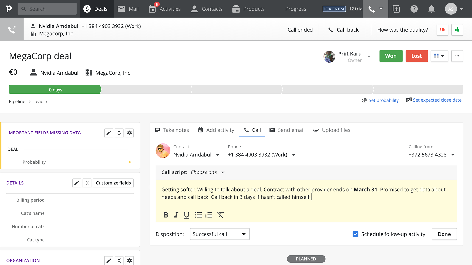
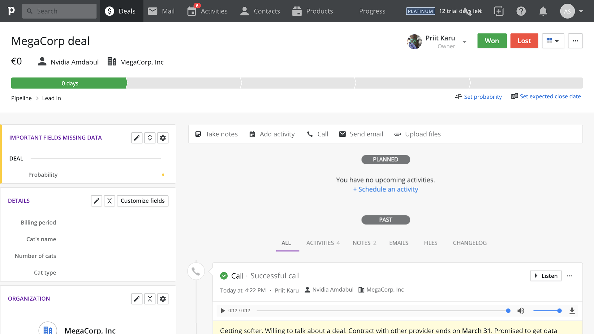
Final solution
As you saw from the concepts, I considered and iterated on multiple solutions, firstly something built into the detail view layout which made the user stuck to that one view, then an interface that would hang from the top menu bar, and finally a widget that would hover on top of the web app, allowing for full visibility of the CRM content and free navigation throughout the app.
I iterated further on the initial floating widget concept, optimizing the layout and going in-depth with all the needed interactions. I added an (error) messaging system and integrated the note-taking and post-call all into that same floating widget.
I felt that the design process could have been more "by the book", but the way the problem was presented to me, together with the fact I'm a visual thinker, formed the design process the way it did. Our customers still use the feature in 2023 and most of the issues they have with the solution are regarding call quality, pricing, and other details not specifically under a designer's control.
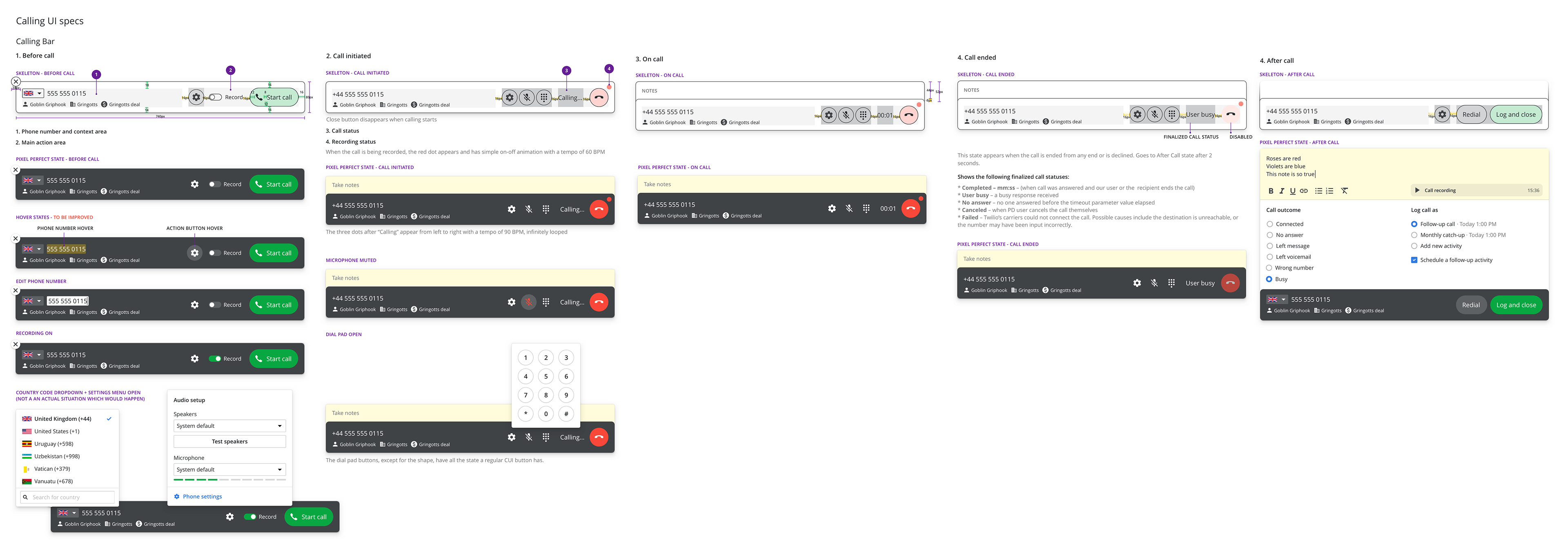
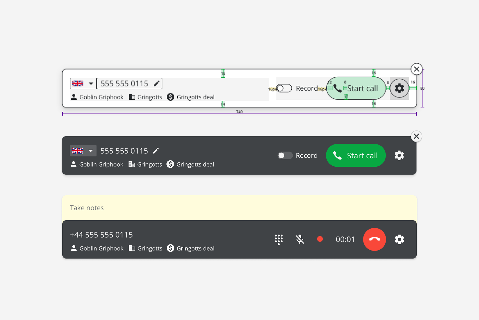
A handover artboard (yes, it was Sketch times) with different states and explanations. The skeletons weren't necessary but for clarity I did them anyway, as the UI elements were custom and borderless in the default states.

The stack with messages, errors, notes

Different stackings illustrated
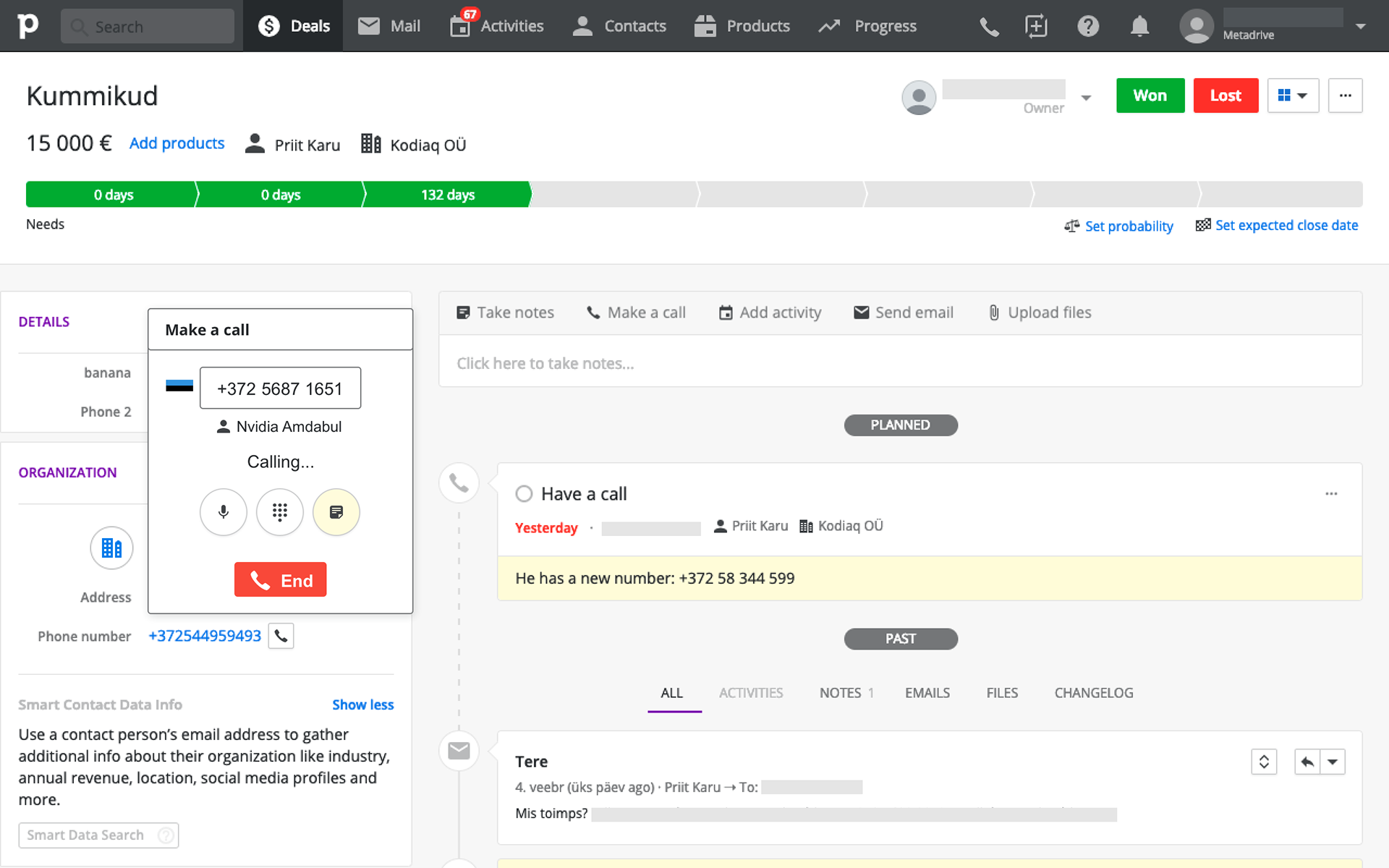
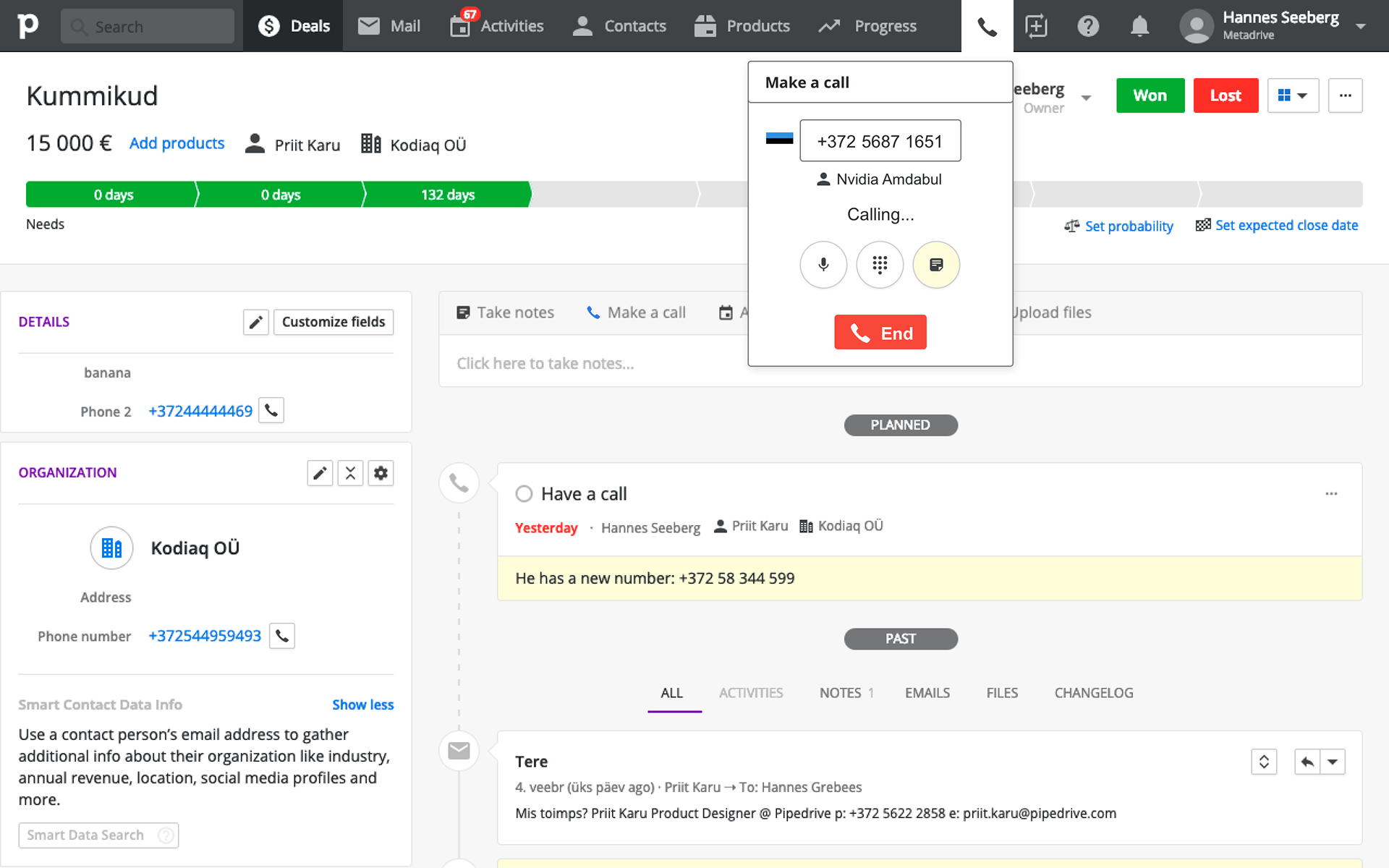
Live demo
Post-release
After the release we conducted further research – a round of interviews was made and a dashboard with relevant data was set up for us to monitor. We also set up a survey via our in-app Customer Success solution provider, targeting heavy users and churned users separately with separate questions to understand what is good and what could be improved.