As the Pipedrive web app was starting to look outdated and increasingly inconsistent, we needed to reinvent the design system basics in order to be able to carry out a visual update.
Discovery
The first phase of any design process is discovery. For this project, I used desktop research as the prevalent method, as a number of world-class design systems are publicly accessible on web. I started to look at how the best design systems are architecturally put in place and how I could apply this to Pipedrive's design system.
I mainly drew inspiration from IBM's Carbon, Atlassian's Design system and a number of others. The awesome developers from my development team also gave great input from what they'd been thinking and were eager to implement on the technical side.
The main things I discovered and wanted to apply were:
▪ the use of semantic design tokens, meaning that colors and other styles weren't necessarily named after their properties but rather after their intended use;
▪ the arbitrary naming logic for basic styles were named which did not define or limit their properties or relationships to each other (more on that later);
▪ the layered approach with base styles, theme layer and application layer which allowed for maximum flexibility.
Definition
As we wanted to have a state-of-art design system, there was no question in what to apply from the best practices we learned. We wanted to apply as much as we could!
Arbitrary naming logic
The old Pipedrive color system was based on base colors, mixed with a certain amount of white. For example, there would be $green-100, $green-88, $green-64, etc. $green-100 would be the base color, $green-88 would be achieved by making the opacity 88% on a white background, etc. These colors were used directly in components and in the UI and the usage was based on convention rather than solid rules.
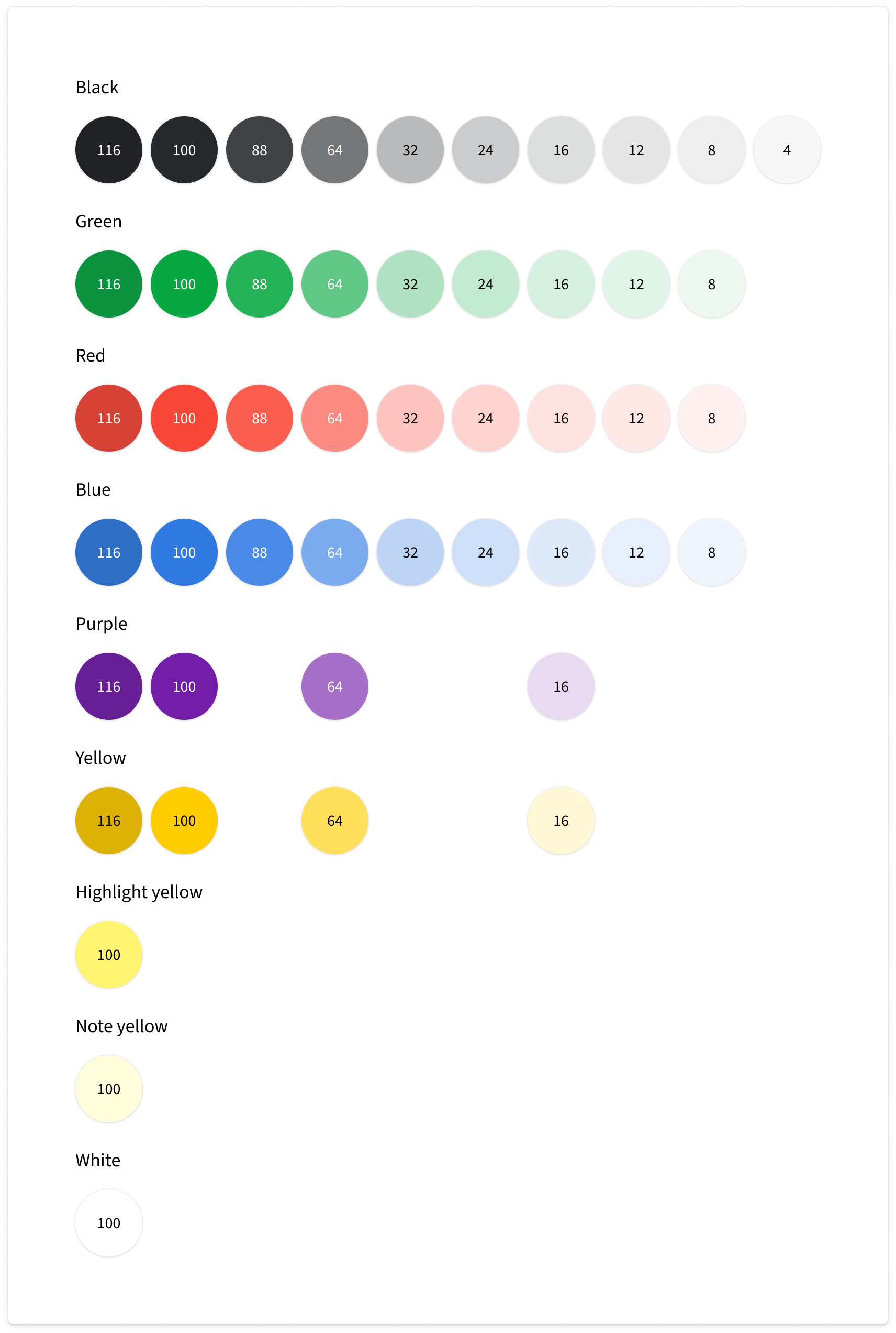
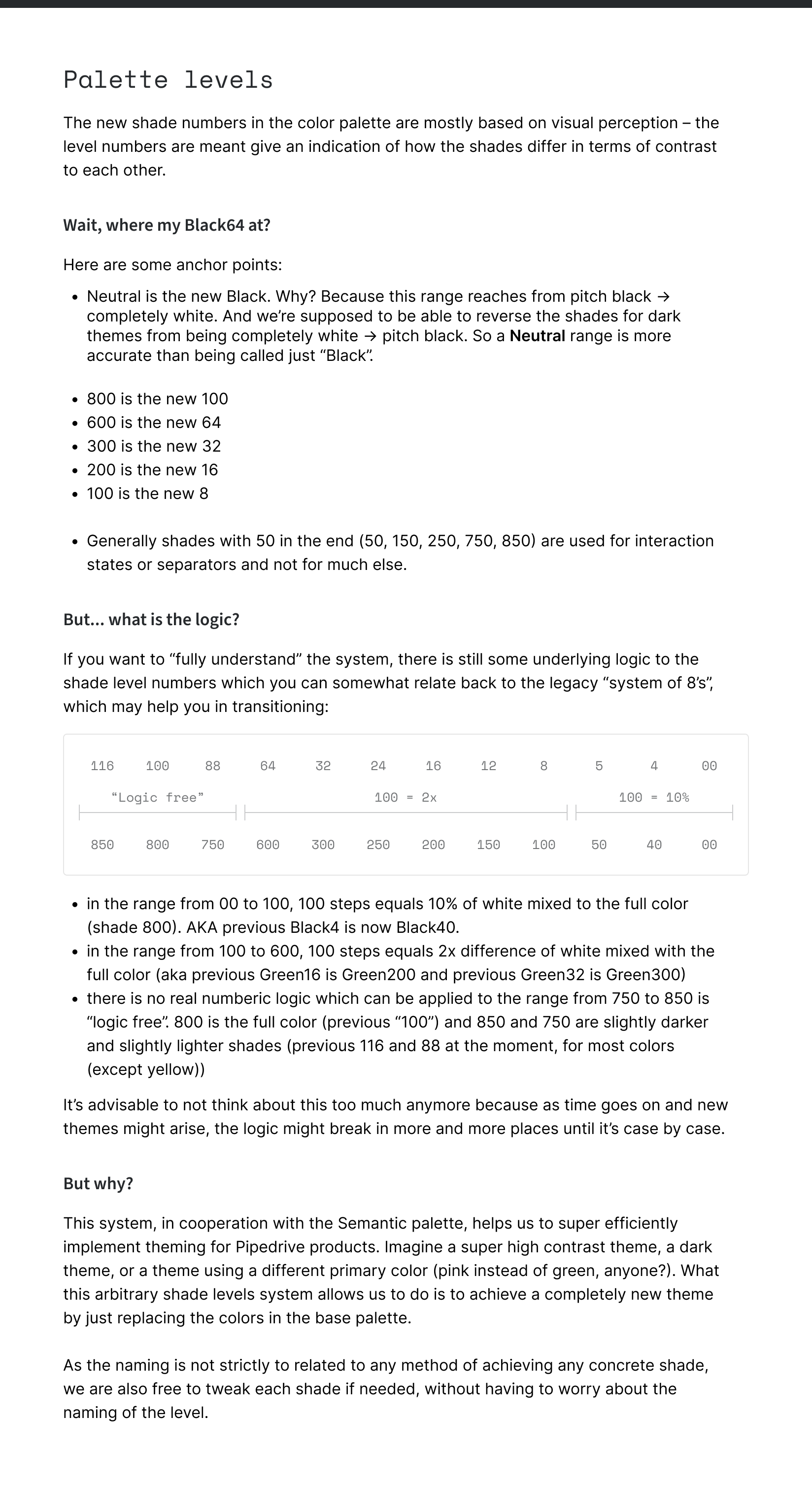
Although the first theme had to look exactly like Pipedrive had looked so far, meaning that it had to use the same colors, I knew that we would like to move away from this opacity-based hierarchy to a much more solid contrast-based solution in the near future. That meant that there was no point in naming these styles as they were named before, as the colors for future themes would be constructed on a whole different basis and opacity would vary from color to color. I saw multiple approaches to this but eventually resorted to a system where each color had 12 shades with numeric values from from 0 to 800. I mapped all the existing colors to these levels.
You can see from the first iteration of the Classic color palette (legacy theme) how patchy our old needs-based color system actually was in terms of shade availability. On the right you can see also this document I created trying to explain the new base color system to people used with the old one.
Pre-semantic old colors

Semantic Classic color palette – first iteration
Explanation on how to think of the new system
Needless to say, by now the theme is tidied up quite a bit, all colors having 11 shades, each shade level contrast-matched to all other colors on the same level.
Layered approach to tokens
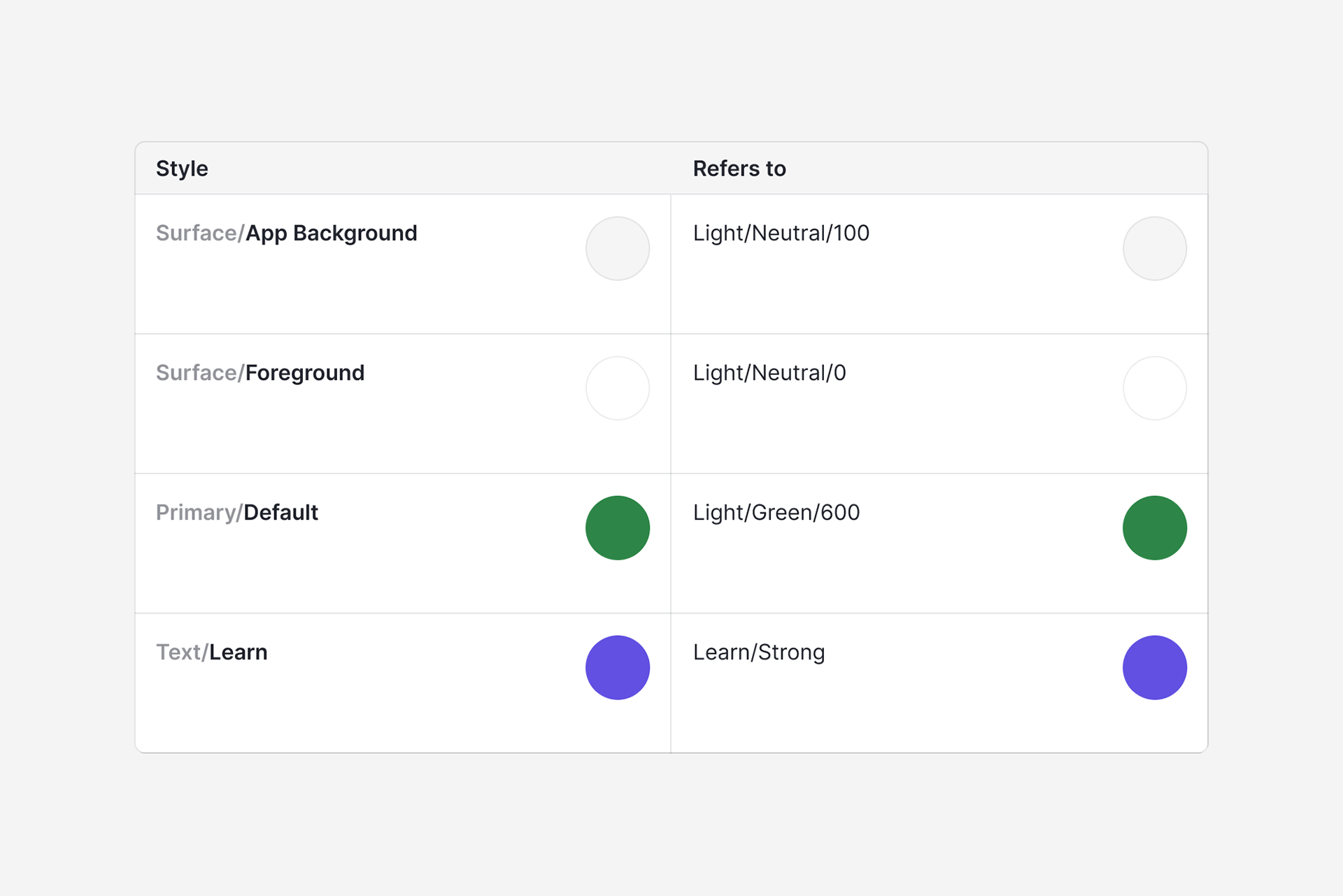
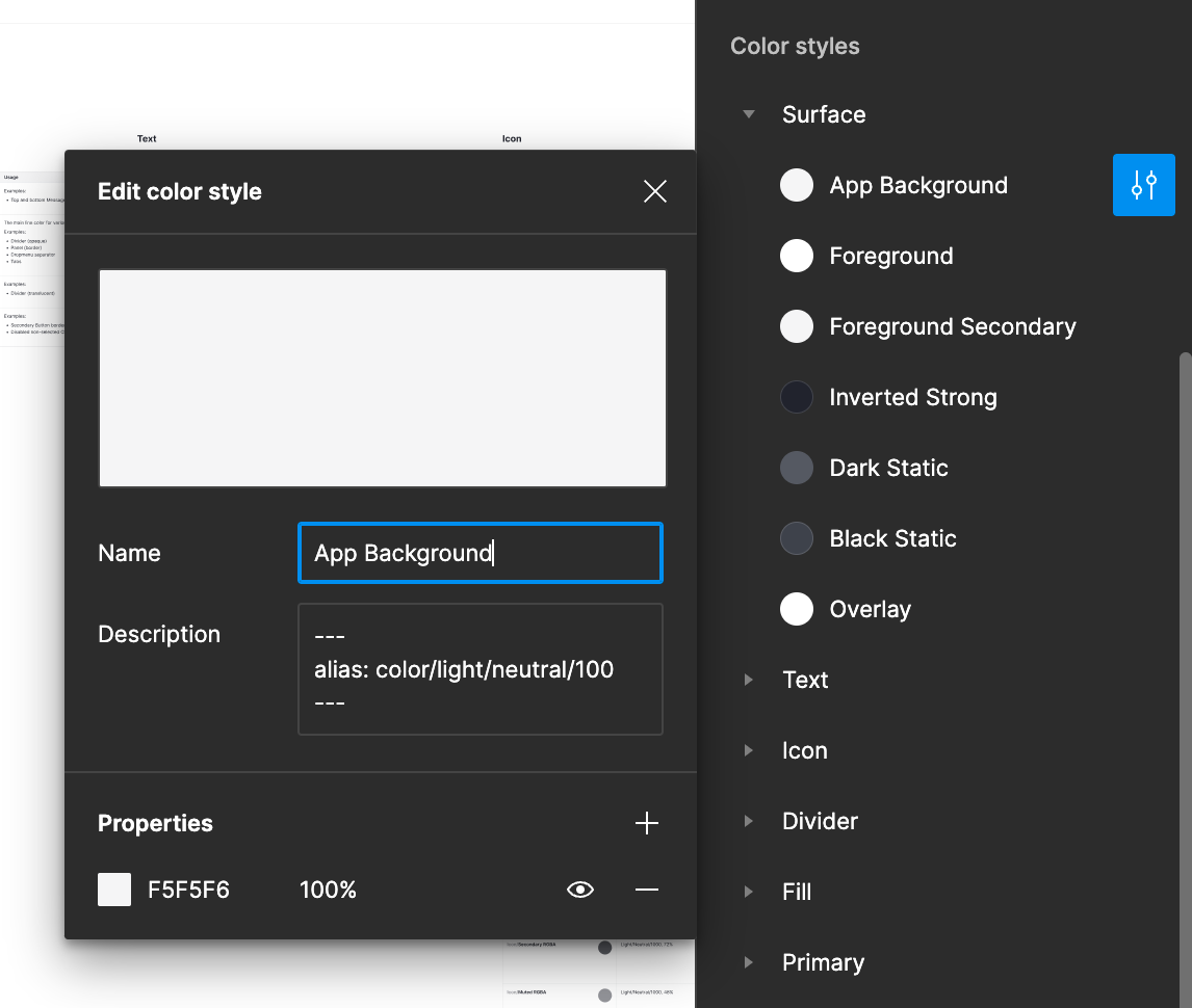
On top of the aforementioned base layer of colors would sit the semantic layer that would also act as the theme layer. I defined groups like Surface, Fill, Divider, Text, Icon, Primary, Secondary, Active, Negative, Warning, Positive and Info.
The colors from the semantic layer would be firmly linked to a base color. For example, $primary-default would link to $green-600. $warning-strong would link to $yellow-700. There'd also be secondary links, for example $text-warning would link to $warning-strong (not $yellow-700 directly). As Figma does not allow referencing natively, we've done this manually via style description fields. In code, the linking gets done based on these descriptions.
Linking the semantic layer to base layer (alias)

The design system asset model (base layer sits below it all)
This system allows to create new themes just by modifying the base palette color values. For example, for a dark theme, the semantic layer could remain exactly the same as in the light theme, just the base layer would have the color scales inverted (and tweaked of course, if needed). By now, the dark theme has actually been created in Figma and in code. And it works!

Surface semantic group
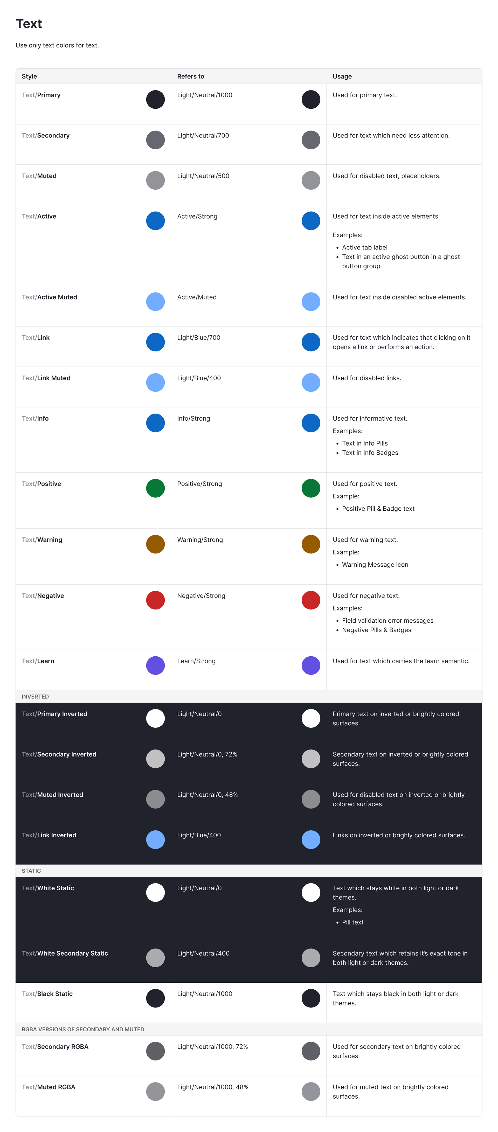
Text semantic group
By the way, you can find the Pipedrive design system on Figma Community for a deep dive.
Develop
Surface logic
A big unplanned topic to tackle was the surface logic in Pipedrive. As I needed to define background and foreground colors for surfaces, I opened a black hole of inconsistencies in surfacing. That led to more work in defining how surfaces and elevations should work in the web app, and the need to communicate that to different teams.
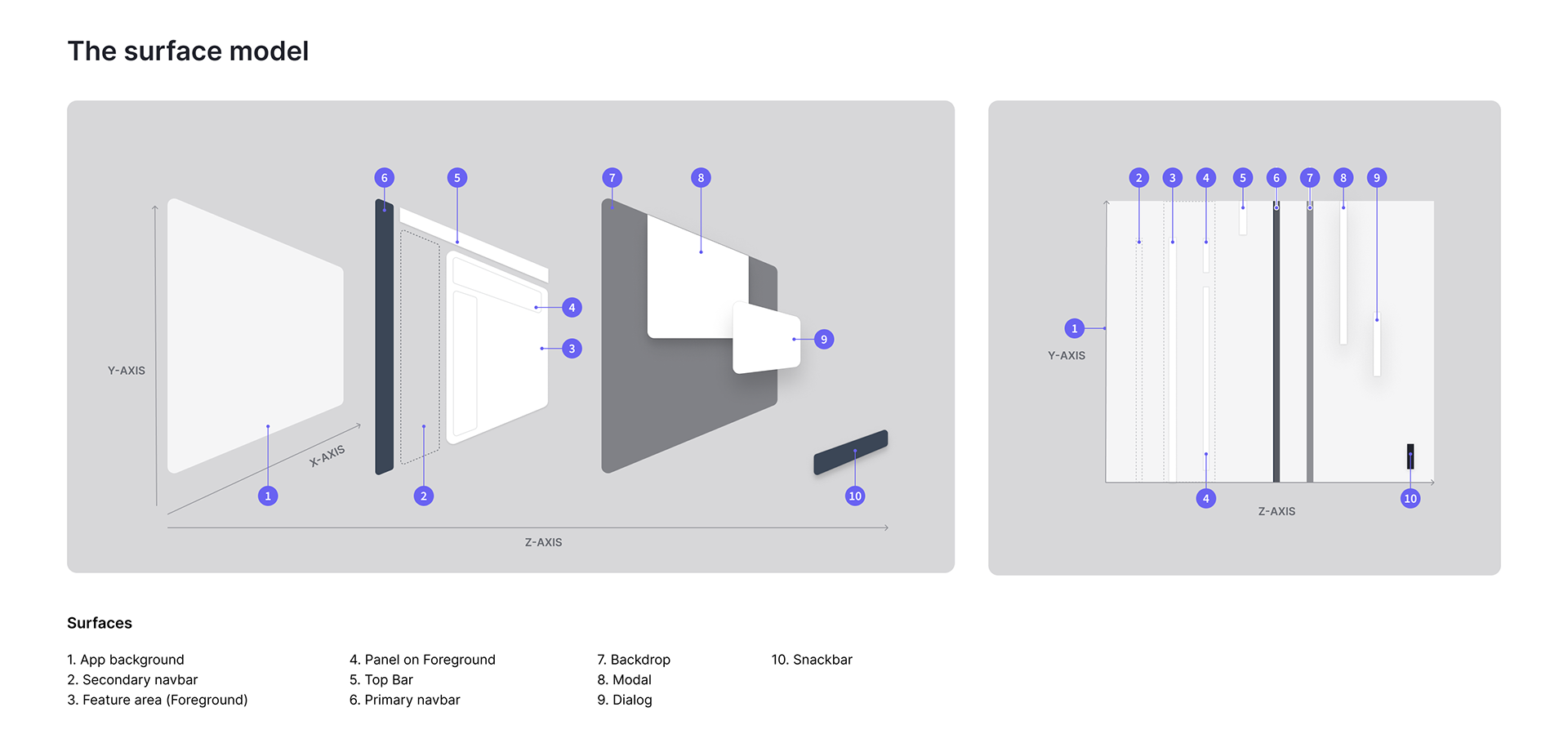
The Pipedrive web app surface model I created
Components refactor
Needless to say, each and every design component had to be refactored to use the new style tokens, both in Figma and in code. It was a huge undertaking to say the least, lots of manual work in Figma, as I also needed to create components for the Classic and the Modern theme. I created the Classic theme more as a proof of concept to be 100% sure that (1) everything looked exactly the same as before, and (2) that the theming system was flexible enough to allow all the planned visual changes for the modern theme. The system held up.
Delivery
Rollout
Coming back to theming once again, the plan was to create a Classic theme that would look exactly like the then-current Pipedrive, and after that, a Modern theme with all the planned visual tweaks. We would first migrate the web application on the new design system using the Classic theme with no perceived difference for the users. When all the views would've been technically updated, we could "flip the switch" and turn on the modern theme, thus revealing the visual update. In reality, product management considered the visual update so minor that it was gradually rolled out as services got updated, without one certain "flip" point.
We didn't have the capacity to fully overhaul the color system even for the Modern theme and that I recall was the only setback as some customers reported worsened contrast differences between some texts. We made quick fixes to the theme and since that time the negative feedback stopped. By now (2023) the Modern theme palette has been completely rehauled by my team, is contrast-based and WCAG 2.0 AA compliant like I wanted it to be.
Fun fact – soon after the visual update rollout, a brand update was initiated by marketing and we found ourselves having to update the theme once again to introduce new semantics and new brand colors. Thanks to the system, there were no technical obstacles.